

The Lunchbox is used for animation testing and motion studies by animation professionals, studios, teachers, students, animation schools.
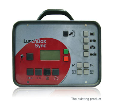
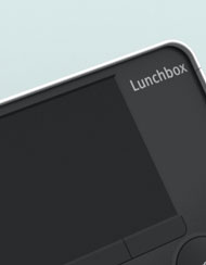
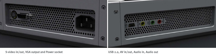
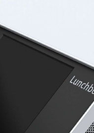
The existing Lunchbox is shown at left.
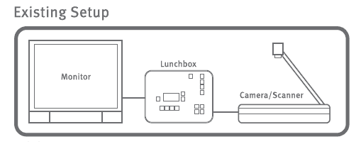 |
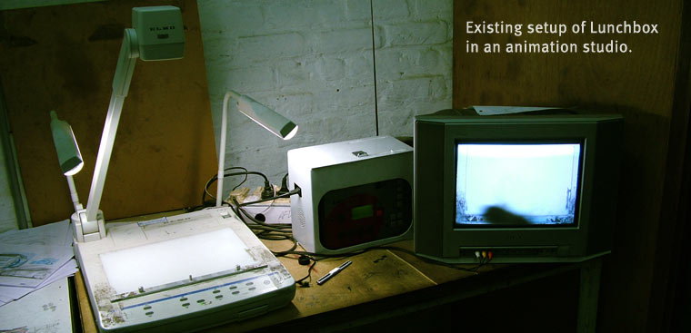
The existing setup consists of 3 parts, the Lunchbox, camera and a TV monitor. |
 |
|
| Although Lunchbox is one of its kind as a product, and it has made some work really easy compared to the earlier setups, but it also has few drawbacks; like
> There is no feedback from the device for many functions. > The icons used are not easy to relate for most for the user. > Most buttons have multiple functions, and some functions need combination of multiple buttons, which becomes difficult for most users. > Though the Lunchbox is portable but one has to carry a monitor to view the replay, which makes the setup bulky. > There are too many buttons; even the not so used and critical function buttons are given same size as the most commonly used ones. |
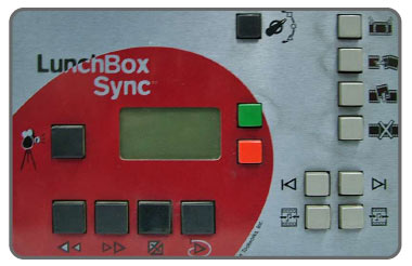 |
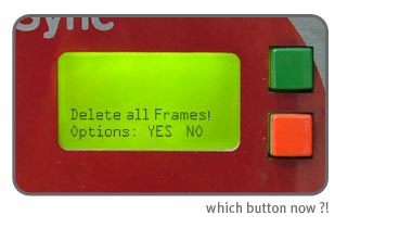
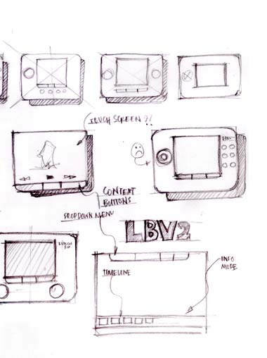
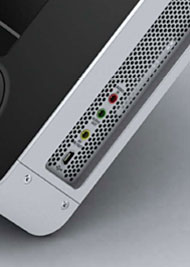
| Here is an example of one of the many problems of the user interface of present Lunchbox, There are two confirmation buttons, green is for ‘yes’ and red is for ‘no’.In some part of the world this association with red and green are not same as West. Because of the positioning also many users find it confusing and often make mistake. |
 |
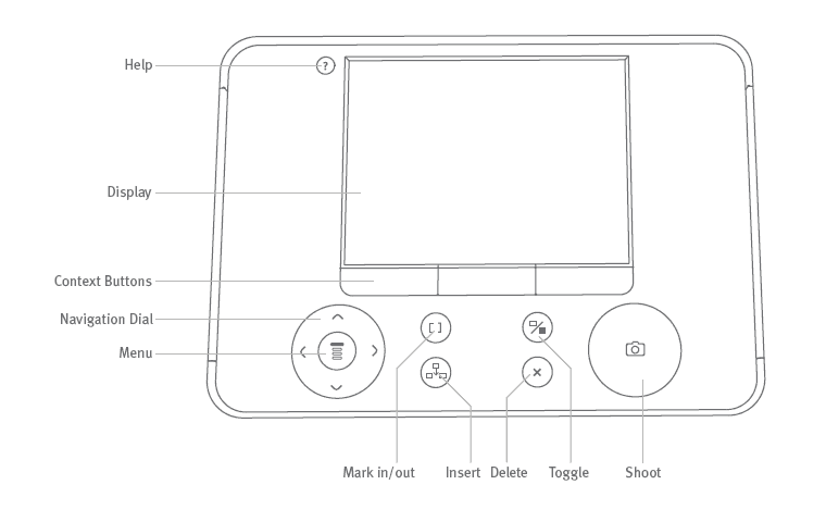
Some major considerations for the new design > Buttons for different functions should not be confusing. > The icons should be more familiar. > Feedback for all functions. > The buttons for different options should be very clear. > Critical functions should not be easily accessible. |
|
 |
 |
 |
 |
 |
 |
    |
|
    |
|
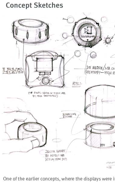
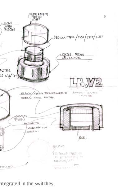
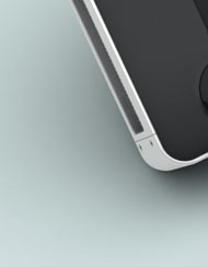
| Design Features:
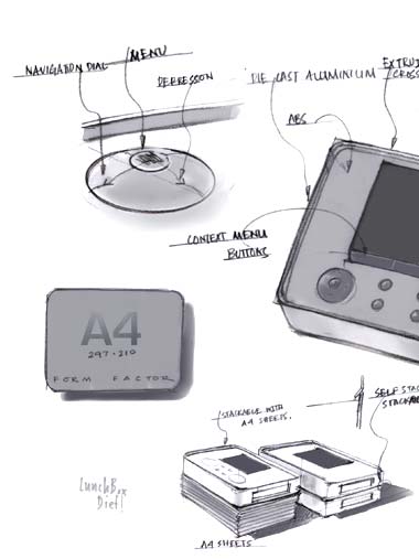
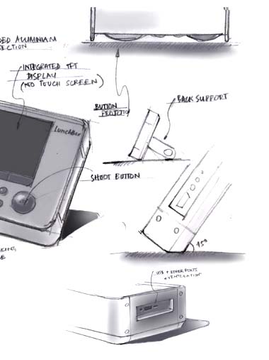
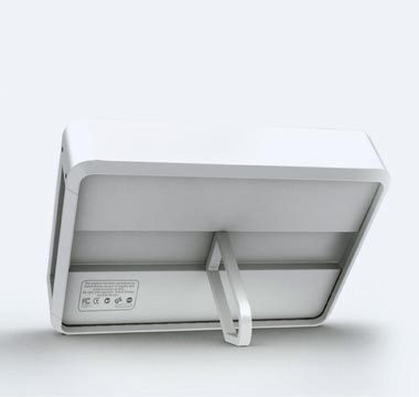
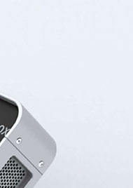
The new design is also inspired from classic lunch-box form. It is made of 4 aluminium panels, two of which are extruded cross-section and the other two are made of die-cast aluminium. The front panel is matt finished ABS and the back panel is made fro extruded aluminium sheet. The switches are made from glossy acrylic > It has an integrated colour LCD to view the replay, which makes the setup portable. > The size is same as A4 sheets (most commonly used format of paper for animation) so it can be stacked with bundles of papers. > It can be kept at 45° angle which makes it easier to view. > The front panel is fixed at a depth which protects the switches and display from scratches and also makes it self-stacking. |
 |
 |
|
 |
|
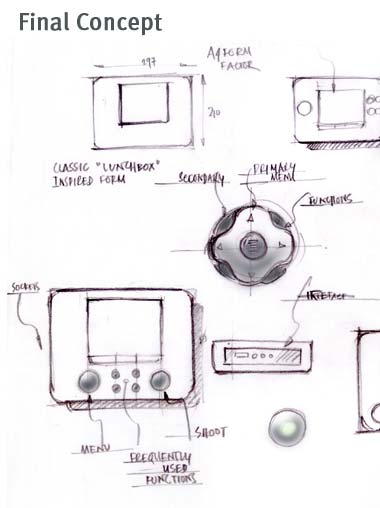
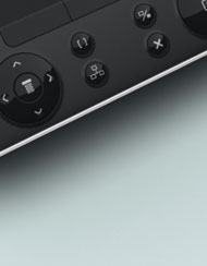
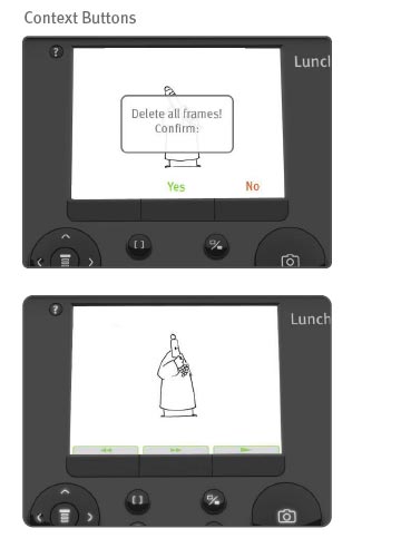
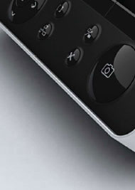
Interface Design Features The user interface of new Lunchbox is totally revamped incorporating some features from the classic Lunchbox. > The number of switches has been reduced, only the most used functions are given separate switches, all critical and not so used factions are accessible from the menu. > As most professionals use many software applications for the production, the interface has been designed with some aspects of those computer applications. > There are context-buttons which makes it easier for the user to access. > A help mode button is added which can be accessed at any point of time with a dedicated button. The position of the help button is placed similar to the F1 (used as a hot key for most computer applications) button in the computer keyboards. > The position of the help button is located in such a way that it can be accessed easily irrespective of the command. > For all functions sound feedback option is given. > The most critical commands (like ‘delete all frames’) ask for double confirmation messages, which reduce chances of making mistake. |
|
    |
|
    |
|